Welcome to the EnergyXYZ Geospatial blog

Our goal with this site is to give those in the energy industry a place to learn about what you can do with maps and GIS (Geographic Information Systems) to further your analytical needs. We will be sharing resources, news, and data in the hopes that we can help you improve your skills and knowledge about mapping and GIS.

Tuesday, November 27, 2007

More from Google (Terrain!)

Google has recently added a new terrain feature to their widely used online mapping application. In the "pre-digital age" terrains and relief shading were painted or drawn after years of surveying the landscape with manual instruments. For great examples of this type of work look to Swiss cartographer Eduard Imof as well as many others.
Eduard Imhof


"Karte der Gegend um den Walensee" (section) by E. Imhof 1:10,000, 1938."

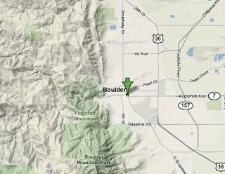
Nowadays terrain like Google's are generated digitally from Digital Elevation Models. Overal it's a great addition to an already impressive product. It's interesting to toggle between the satellite imagery and the terrain. In many cases the terrain allows you to visualize the landscape much better than the photograph. Example below:


Monday, November 12, 2007

Google at the Gas Pump

In case you missed it on CNN, starting next month Google is going to start offering map directions for local businesses, restaurants, hospitals, et cetera, at over 3,500 gas stations via a small color computer screen. I'm assuming it's a light-weight version of their Google map product. The initial offering will allow users to search several screens of common listings, but you won't be able to type-in individual addresses just yet. From what we know of Google, we won't have to wait too long. Once you find the directions you need, you simply print the map with your receipt.

Bringing digital directions to the gas pump seems so obvious (now); but it takes an ingenious company like Google to make it a reality. It's hard to find many companies that are changing "how we do things" on such a broad-scale and in so little time.

You can read the rest of the article here: Google at the Gas Pump

San Francisco Bay Oil Spill


Here are a few examples of some maps of last weeks San Francisco Bay Oil Spill made from Google map-maker tools. The San Francisco Chronicle's map and the KCBS map.

Thursday, November 8, 2007


These FAA flight pattern maps may be some of the most beautiful and abstract maps you've ever seen. The maps were created for the Celestial Mechanics project, " that visualizes the statistics, data, and protocols of manmade aerial technologies".

Friday, November 2, 2007

McGraw-Hill Offices on the Map


We put together a quick map of an updated list of McGraw-Hill Offices in the United States. We also plan to get all of the international offices in soon. This map is a great example of beginning to build a mash up of data. This is just a first pass of mapping the offices. We would like input from other McGraw-Hill employees and eventually a revised list of actual locations. After you take a look at your office, check out the Bird's eye view and try the 3d view as well. You will be prompted to download a 3d driver. The capabilities of both Microsoft's Live Search Maps and Google's Earth/Maps are still developing, but it is already a great way to find information and data in a visual way.

Globe4D- the four dimensional interactive globe

Here is an example of how traditional geospatial products like the globe are changing due to advancements in geospatial technologies and a growing public interest.

Globe4D is an interactive globe that allows users to view data-sets as they change over time - time being the 4th dimension. It's an interesting concept and gives us all something to think about and look forward to. How useful would it be to add custom data-sets and view those data-sets over time (forwards and backwards) in a "hands-on" interactive environment? Be sure and watch the product videos at the companies website.


You can learn more about the globe: here

Thursday, November 1, 2007

Platts releases Power Plants of Russia map

Platts has utilized the latest, industry-leading generation data to create this wall map of the supply of current and planned generation in Russia. The Power Plants of Russia, 2007/2008 edition, is the most accurate and detailed power generation reference available. Map features include:
-Nearly 800 existing and planned power plants, colored by primary fuel type, symbolized by operational status and sized by generation capacity
-Detailed plant locator table including plant name, operator, fuel, installed megawatts, projected megawatts and plant operational status
-Rich geographic content including topography, major cities and states